

67 m² (약 20평)의 작은 투베드룸 아파트 인테리어.
이 소형 아파트는 1~2인 가구에 적합하도록 설계되었다.
기존의 레이아웃도 흔히 한국에서 볼수 있는 평면은 아니지만 공간활용을 위해 쪼개어놓은, 답답한 인테리어라는 점에선 한국과 유사하다.
이 평면에서 주목할 점은 과감하게 내부 벽체를 거의 없애버린 것뿐만 아니라 주방과 화장실의 위치를 완전히 바꿔버렸다는 점이다.
보통 리모델링을 할때 상하수도를 잘 건드리지 않는다. 바닥공사를 모두 새로해야할 뿐만아니라 상하수도 공사를 위해선 보통 아랫집과도 연관이 있기 때문이다. 정말 뜻하는 바가 있거나 큰 돈을 들이는 것에 부담이 없다면, 이 집의 디자인을 참고하시길.
이 프로젝트는 1950년대 이후 슬로바키아의 전형적인 구조화된 아파트의 공간배치를 개편하는 것으로,
젊은 가족을 위하여 사회적 상호작용을 위한 다목적 주거공간을 만들기 위해 진행되었다.
이 공간에 거주할 사람들에 초점을 맞춰 무엇이 중요하고 필수적인지, 그리고 어느정도면 충분한지 논의하였다고 한다.
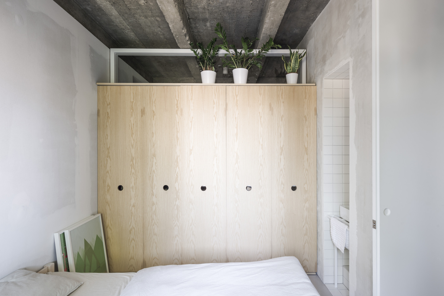
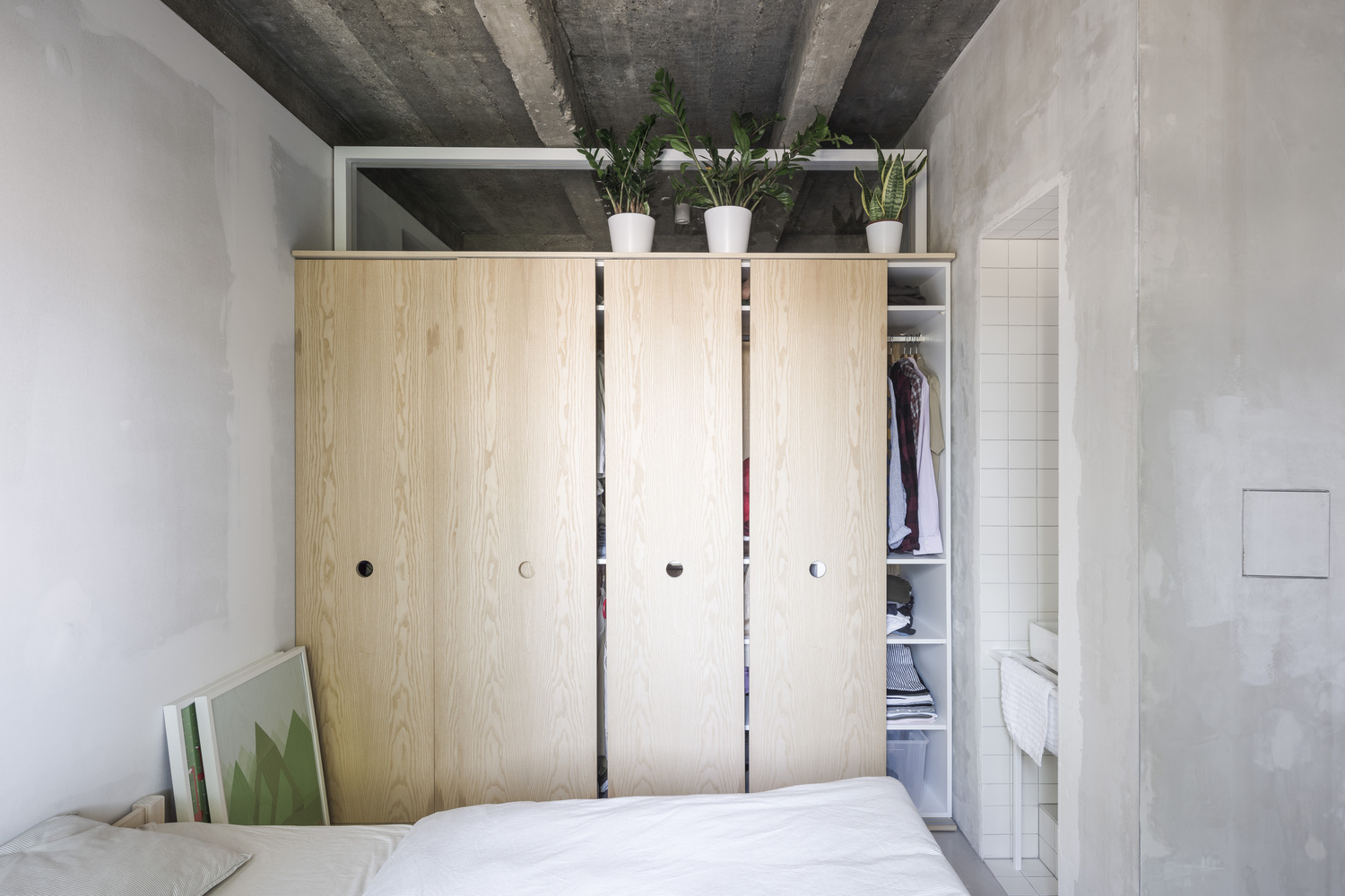
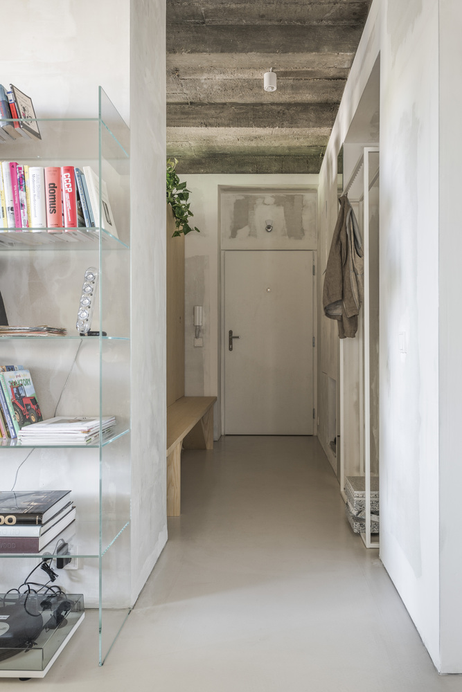
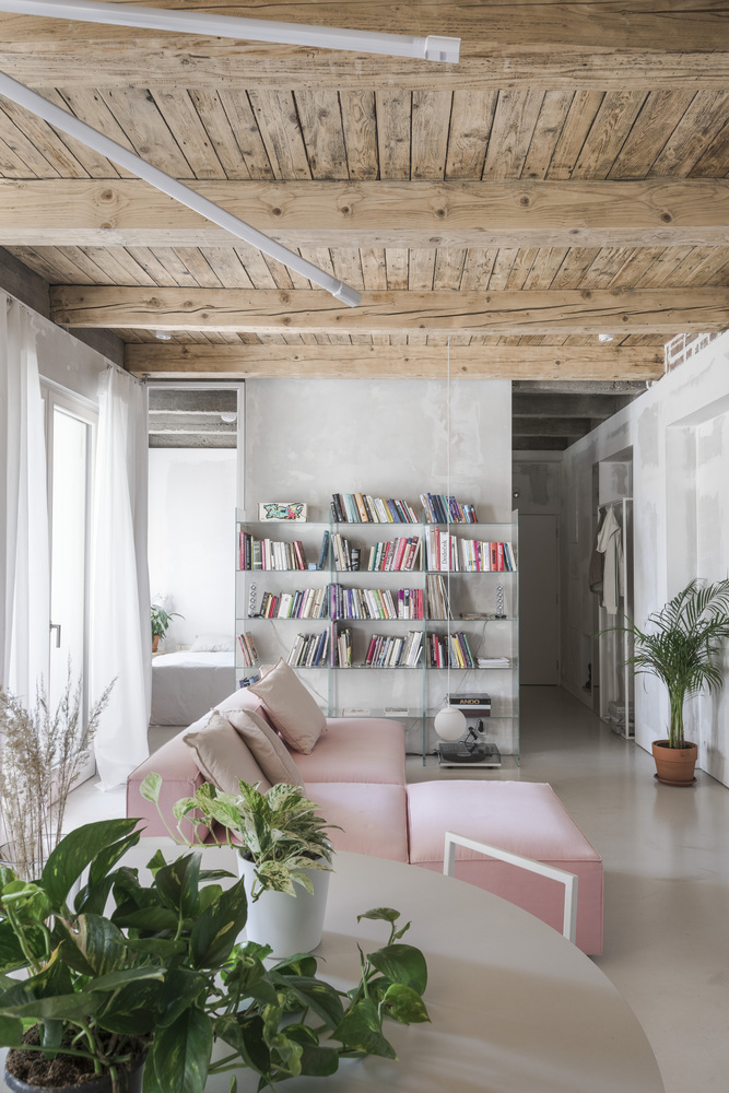
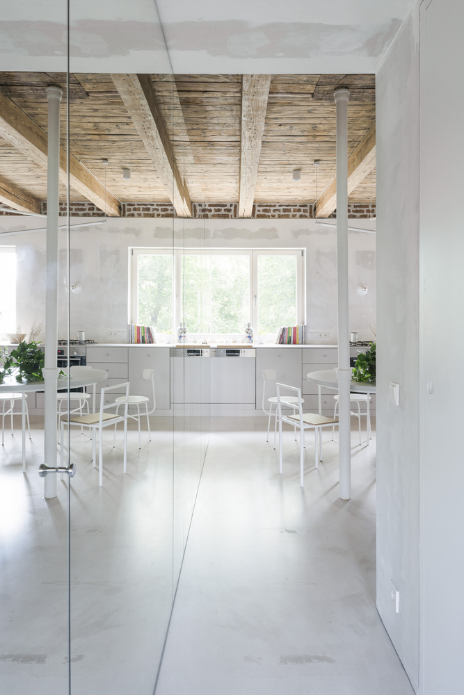
거실과 부엌 등 주간에 사용하는 공간은 출입구와 화장실과 가까운 아파트의 중앙부분에 배치하고 사적공간은 아파트의 끝부분(실제로는 출입구 옆이지만)에 배치하였다. 거울장을 이용해 수납공간 해결과 함께 넓지 않은 공간을 확장시켰고, 화장실을 유리벽으로 오픈하여 답답함을 없앴다. 침실 또한 답답하게 벽으로 막지 않고 옷장의 윗부분을 오픈하여 숨쉬는 공간을 완성했다.
건축가가 제공한 텍스트에 글쓴이의 의견을 더한 내용입니다.


There are 2 main aspects of this project. The first one is reshaping the typically structured space arrangement of the apartment, originally from the 1950s, with the intention of creating a multipurpose living space for a young family, that would put an emphasis on the importance of social interactions.
The second aspect is more theoretical in its nature, we approached this project as an opportunity to take our internal discussions (on the use of space, materials, structures, processes, and the extent of the use-ability of the details in and of itself) and turn them into reality. As what is, what suffices, what is essential, and what eventually does not have to be important starts to lose sense once the focus is shifted towards space itself, the experience, the individuality, and most importantly, the people who will inhabit this space.
The original space arrangement of the apartment has consisted of a hall, which has led to a kitchen that had a small storage room and access to a modest living room, a guest room (that originally served as a maid’s room), and a toilet that directly neighboured the loggia. A bathroom, which was located centrally next to two bedrooms, was located at the end of the apartment.
Our concept opens the apartment up - in the space, materials, and construction, in height but also in width. It is divided into two tracts that are defined by the construction system of the building itself.
The apartment is oriented towards the west-east. The day-zone is located in the middle of the plan, connected to the bathroom, loggia, and the entrance area. It contains a large kitchen unit, a round dining table, a living space, and a mirror set piece, which defines the boundaries of the space and creates a connection between the beginning and the end of the apartment. This mirror also serves as an entrance to the toilet and two additional storage spaces. The entrance area is additionally lit up with a fanlight, that is located above the cupboard in the bedroom.
The bedroom is located near the entrance and on the opposite side of the plan as the kid’s room, which provides sufficient intimacy and privacy, while space-wise, these two rooms are designed so that they are still a part of the day-zone. The bathroom is entirely “open” towards the kitchen and dining table through a large glass wall that can be (in case of a need) covered with a curtain. The furniture itself is largely tailor-suited by a carpenter, some of the elements are rather special, created as our internal furniture experiments.
Text description provided by the architects.
Kilohonc
www.kilohonc.com
Apartment Svätoplukova by Kilo/Honc
Apartment Interiors•Ratislava, Slovakia
Architects: Kilo / Honc
Area: 67 m²
Year: 2020
Photographs: Matej Hakár
Lead architects: mgr. art. richard kilo, ing. arch. matej honč
'Space Design' 카테고리의 다른 글
| 쉐어하우스 (0) | 2021.07.02 |
|---|---|
| 자취인들의 로망, 꾸안꾸 복층원룸인테리어 (0) | 2021.07.02 |
| [사무실 인테리어] 삶의 질을 높여줄 사무실 책상 꾸미기 (0) | 2021.03.02 |
| [인테리어 소품샵] 우리집을 카페로 만들어줄 홈카페 유리컵은 어디서 사야할까? (0) | 2021.03.01 |
| [아이방인테리어] 남자아이방, 여자아이방 꾸미기 이렇게 해보세요. (0) | 2021.02.26 |


